
Logo Design System
Role
Lead Designer
Tools
Figma
Maze
Whimsical
Year
2025
Problem
One of the major challenges faced within the company was the lack of consistency in the design language and components across different applications. Since various teams adopted different approaches in their interface designs, significant inconsistencies in user experience emerged. This situation forced users to undergo a learning curve with each new application, undermining the brand's coherence and negatively impacting user trust. As a result, these inconsistencies led to a decline in overall user satisfaction.
Solution
To address this problem, the development of a design system is planned. This system aims to consolidate design language, components, and interface standards under a single framework, ensuring consistency across applications. The design system will enable teams to work with a unified guide, preserving the brand's integrity. As a result, users will be able to transition smoothly between applications, with the goal of increasing overall satisfaction.
Process
Step 1
Foundations
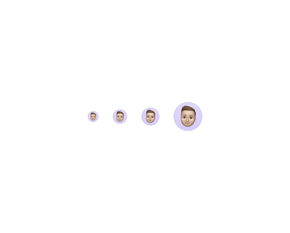
As the first step in our design system, we meticulously crafted the foundational elements, including the color palette, spacing guidelines, typography, and styles.
During this phase, we selected colors that are fully aligned with the brand identity, defined spacing rules to ensure consistency, chose typography that reflects the brand’s voice, and established comprehensive style guidelines. These elements were carefully structured to be utilized at every level of the design system, ensuring overall cohesion and a seamless user experience throughout the project.
Step 2
Design Tokens
We established design tokens derived from our color palette, enabling a consistent and scalable approach to managing color properties across the design system. These tokens facilitate seamless integration and application of our color scheme throughout the project, ensuring uniformity and efficiency in design implementation.
Color Tokens
Step 3
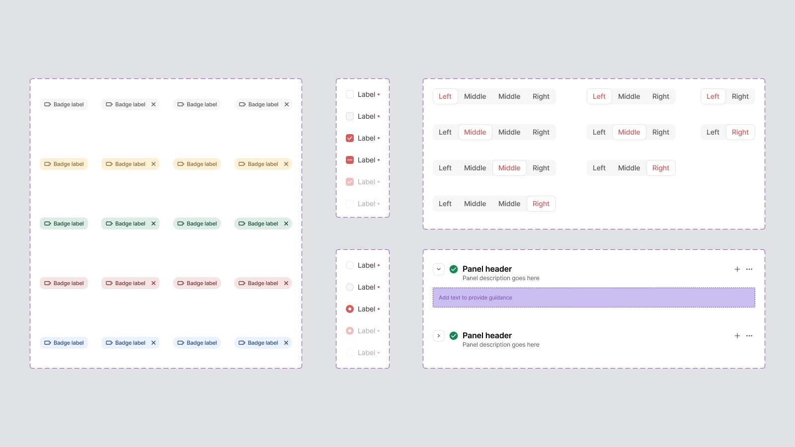
Components
We designed components leveraging the Bootstrap framework, ensuring a strong foundation for responsive and consistent UI elements. Additionally, we developed custom components tailored to meet specific user needs and enhance the overall user experience, providing a seamless and intuitive interface that aligns with our design objectives.

Component Examples
Step 4
General Patterns
We integrated essential design patterns, including filtering, sharing, and sorting, into the design system documentation, ensuring that these patterns are consistently applied across the project. These patterns were thoughtfully selected and documented to address common user interactions, providing a solid foundation for creating a cohesive and user-friendly interface.
To enhance the usability of these patterns, we continuously conduct usability tests, refine them based on user feedback to ensure a more intuitive and efficient user experience.
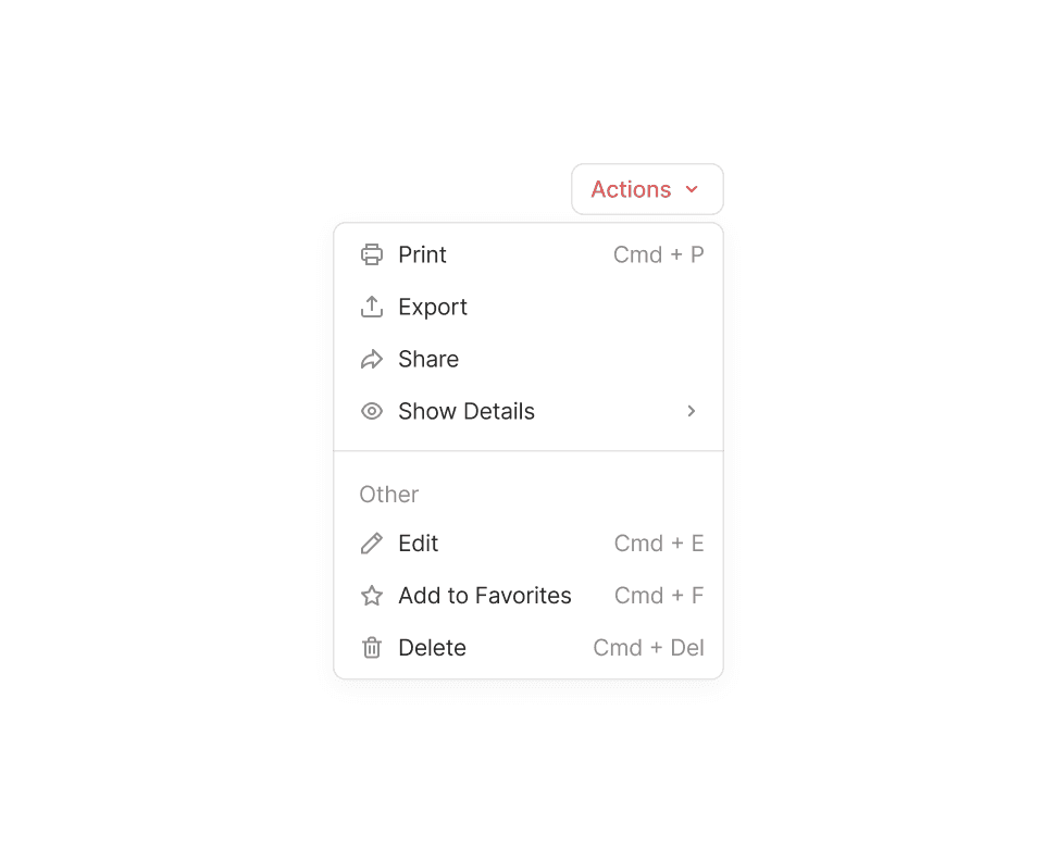
Action Placement
Batch Actions
Collaboration
Empty States
Exporting
Favorite
File Handling
Filtering
Sharing
Step 5
Usage and Improvement
The most effective approach to designing a Design System is to test it on real-world projects. Logo Design System is currently being utilized in the development of our new ERP product.
As we encounter various scenarios during the development of this product, we continuously refine and update our Design System to address these challenges and enhance its effectiveness.
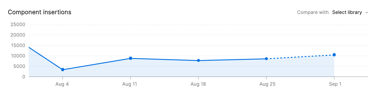

Component Statistics